

Loading cart contents...
Watch Dial Design: Legibility, Proportions and Minimalism
A watch dial is a small space with a demanding job: it has to tell you the time immediately. That sounds obvious, yet it explains why two watches with similar specifications can feel completely different. One requires a second glance; the other makes sense before you have consciously looked at it.
Good dial design is not necessarily about removing everything. It is about deciding which details deserve attention, and which can stay in the background.
What makes a watch dial easy to read?
Start with the hands. Their shape, length and contrast against the dial matter more than the amount of text printed around them. The hour and minute hands should be distinguishable at a glance. If they are similar in length, the dial asks the eye to do extra work.
Contrast is more than black and white
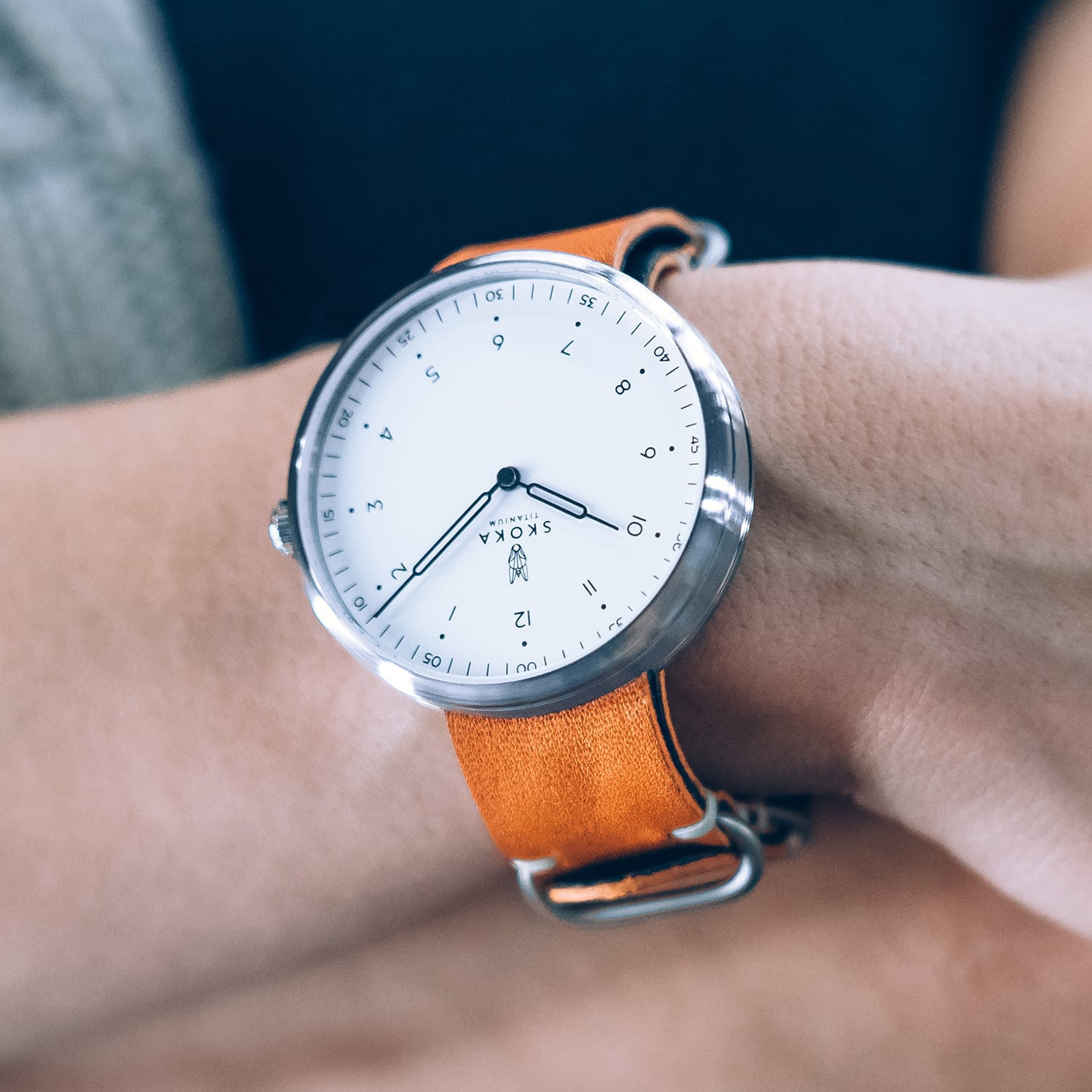
A white dial with silver hands can look exceptionally clean in a product photograph, yet become difficult to read when the metal reflects bright light. A black dial can have the same problem if polished hands disappear into reflections. What matters is the contrast between the elements under different lighting conditions, not just the colours listed in a catalogue.
Look at photographs taken from an angle. They often tell you more about legibility than a perfectly lit, straight-on studio image.
Hand proportions matter
A minute hand that reaches towards the minute markers makes precise reading easier. A shorter hour hand gives the dial a clear visual order. The difference is subtle, but it is one of the details that separates a convincing design from a dial that merely looks minimal.
Why empty space matters
There is a temptation to fill a dial with information: a date window, a detailed minute track, additional inscriptions and decorative elements. Each can serve a purpose. The question is whether they help the person wearing the watch.
Empty space gives the hands room to stand out. It also makes the proportions of the markers and the typography more noticeable. A minimal dial therefore demands precision. With fewer elements, there is less to distract from an awkward hand length, inconsistent spacing or a poorly placed logo.
Minimalism is not the absence of detail
Consider the minute track. It may appear secondary, but its spacing and relationship with the hands influence how the dial reads. The same applies to the thickness of hour markers and the position of the brand name. These decisions are small individually; together, they determine the character of the watch.
Surface finishes change the dial’s appearance
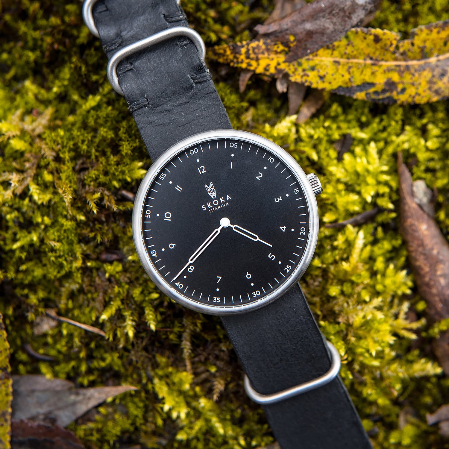
Colour alone does not describe how a dial looks. A matte surface absorbs light differently from a glossy one. Applied markers create shadows. A reflective crystal introduces another layer of highlights. That is why the same watch can appear restrained in one photograph and much more expressive in another.
It is worth viewing a watch in daylight, indoors and from the side whenever possible. For online shopping, compare several photographs rather than relying on the main product image.
How dial design relates to the case
The dial is not an isolated graphic. Its apparent size changes with the width of the bezel, the shape of the crystal and the proportions of the case. A relatively small dial opening can make a watch feel compact and technical. A wide opening can make the same case diameter look larger.
That relationship is particularly important in everyday watches, where the aim is usually to combine easy reading with comfortable proportions. The case should frame the dial rather than compete with it.
The approach behind SKOKA Ti-01
In SKOKA Ti-01, the dial is built around a restrained visual language, while the Grade 5 titanium case provides a distinct material character. The combination allows the shape of the case, its finish and the dial to be considered as one design rather than separate decorative choices.
The differences between a light and a dark dial are worth examining in real photographs. They change the watch’s mood without changing the underlying design. Neither is automatically more legible in every situation: the relationship between hands, markers, surface and lighting is what counts.
What to check before choosing a dial
Look at the watch at a normal reading distance, not only enlarged on a screen. Can you distinguish the hands instantly? Do reflections interfere with them? Is the minute scale useful? Finally, ask whether you still like the dial when you stop examining individual details and simply look at the watch.
A well-designed dial rewards close attention, but it should never demand close attention just to tell the time.
Frequently asked questions
Is a minimalist dial easier to read?
It can be, provided the hands and markers have sufficient contrast. Fewer details do not automatically mean better legibility.
Is a black or white dial more practical?
Both can work well. Hand colour, reflections, finishing and lighting make a greater difference than dial colour alone.
Why does a watch look different in photographs?
Lighting, viewing angle, crystal reflections and the surface finish change how the dial and case are perceived.